Lots of people have their quirks when they check into their room. Some are neat freaks and like to toss the comforter and television remote in a pile. I’m sure they would burn them if they could, much like in The Velveteen Rabbit. Others order room service, pull out the laptop, and get straight to business.
Me? I like to examine the fire escape route on the back of the door. 😀
Although I’m not normally testy about the kind of upgrade I get at a hotel, if any, I do realize that there can be significant variation between rooms. Some hotels are long and narrow. If you see one suite, you’ve seen them all. Others have more quirky architecture or are renovated from buildings that had a former life. Many independent hotels are like this. There may be ten of the “same” suite, but each with different floor plans and views.
I like the explore the fire escape route not because I care about how to get out in an emergency but because it is often the most accessible source of this information. If I get a dud suite, it would be nice to know if I was merely unlucky during room assignment or if all suites have a similar flaw.
This morning’s review of the Lorien Hotel & Spa in Alexandria, Virginia, indicated that I was not a fan of the living room if only for the absence of natural light — or at least a warm-tinted lamp. At the Grand Hyatt Seattle, the lighting was fine but I was disappointed by the extremely narrow floor plan.
I’m fairly sure that the Grand Hyatt has more spacious rooms facing Puget Sound, but I was upgraded on an award night to begin with and was satisfied with a room that viewed Capitol Hill to the south and east. (Though I am getting tired of the fact that every hotel room I have ever stayed at in every Seattle hotel has faced the same direction.) It’s a square building, and I was probably just on the side with smaller suites, with standard rooms filling in between the corners.
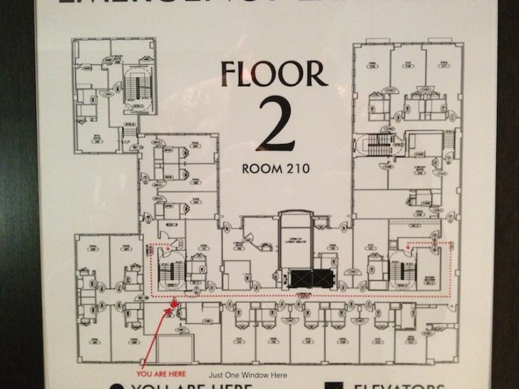
The situation at the Lorien is more complicated because it has a courtyard and appears to be a split-level design formed by combining two buildings. I began my review by saying that the hotel has a fair number of suites and that other Inner Circle members, like me, had a good chance of being upgraded. I got this information from the fire escape plan. Looking at the map below, you can see that there are at least four other rooms on the same floor that appear to be one-bedroom suites. The key is to look for three rooms since a suite will usually have at least two large ones plus a third for the bathroom.
Some of these suites don’t have a physical door separating the living room and bedroom, but their size and the narrow space between them make me think the particulars of their design just didn’t allow one. I’ll give them a pass.
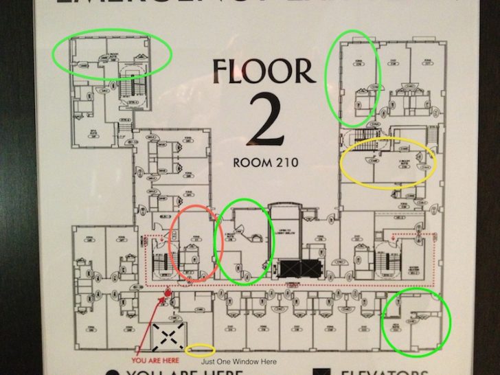
But if you couldn’t tell what I’m talking about from that picture, I’ve annotated the map below. The circles are color coded to give you some idea of how to look for which are the “best” suites. My metric here has a lot to do with the number and placement of windows.
My suite at the bottom had just one window. There is some box to the left of my room that I don’t recognize and which has no entrances on my floor. Perhaps it’s a maintenance duct or trash chute. It could also be the chimney for the fireplace in the lobby. But it explains why my living room had no natural light.
Rooms with green circles have multiple windows, some on more than one side. These are the rooms I’d prefer to be assigned if I were actually paying for a suite. But again, being given one as a free upgrade I am happy to have had the one I got.
The suite with a red circle may not be a suite at all, but what really concerns me is that there is only one very small opening for a window. That exposed wall can’t be more than half the size of the one in my room. Suite or not, I probably would not want to be assigned to any room with such little available light, especially one next to the stairwell and housekeeping closet.
Why is this useful for anyone other than some obsessed guy like me, who happens to enjoy building diagrams?
Well, if you really aren’t happy with your room, it helps to know what your alternatives are. You might not get a specific room number, but you can at least know that you have the worst of the worst and request something slightly better. It gives some information on tradeoffs. For example, some of the better suites outlined above overlook the street and could have more traffic keeping you awake. Finally, if you’re writing a review of the hotel like I am — or just deciding if you’ll return — you can place your impressions of your current room in perspective.
Some maps don’t have such detailed drawings as the ones here, which indicate windows, doors, and everything else. It might just show a basic outline that provides no information about the walls or contents within. But the more information the better, in my view. Simple pleasures like these maps are one more reason I liked staying here even if they had no bearing on the rest of my experience.


