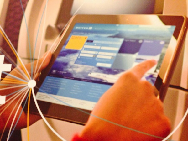
I can’t claim credit for this at all. I even have trouble re-creating it myself. But there is a shot of the new United.com website in United’s latest ad campaign. If you watch the video for their satellite-based Wi-Fi (since removed) you can see someone holding a tablet and navigating what appears to be United.com all done up.
HT goes to Sulley on FlyerTalk for finding and sharing the images first, although they must be from a print ad or something because I don’t see how it’s possible to get that kind of resolution from YouTube.
It looks nice, but I already like the current United.com well enough. It works most of the time. Things are easy to find without making dozens of clicks. For example, I can check my flight status or change seats on an upcoming trip with one click from the homepage — assuming it remembers me. Otherwise it’s two clicks (the first is to sign in). If they make it too graphic-intensive and hide the information, I’ll be very disappointed.
Time will tell whether this is truly an improvement or just some new clothes for Emperor Jeff.


