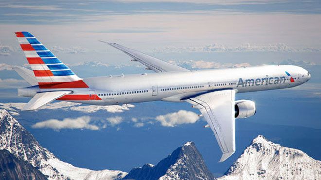
We’ve known for more than two years that we were building anticipation for a moment in time when the outside of our aircraft reflects the progress we’ve made on the inside.
— American Airlines Chairman and CEO Tom Horton
Well, the moment has finally AArived: Yesterday, American Airlines has unveiled its new corporate logo and paint scheme, months after company Chairman and CEO Tom Horton revealed that AA would be revealing a new identity sometime in early 2013 as it plans to emerge from Chapter 11 restructuring. Today, American’s home page, aa.com, has also been redesigned to reflect those changes.
It is common for an airline to undergo a brand reinvention after overcoming a significant setback, such as exiting Chapter 11, or achieving a major milestone, such as completing a complex merger with another major legacy carrier. Delta Air Lines, United Airlines, and US Airways each went through both of those scenarios within the past decade, and subsequently repainted their planes and launched new corporate logos in the process. Delta paired up with Northwest Airlines, United with Continental Airlines, and US with America West Airlines, and each also went through a few painful years of restructuring in Chapter 11.
American was the last carrier of the major US legacies to file for Chapter 11 on November 29, 2011, after suffering for over a decade from a bloated cost structure, fuel inefficient aircraft, poisoned labor relations, critical network gaps, and a burnt out management team that appeared past its prime to lead the carrier to better times.
Roughly 14 months later, American is expecting a new wave of more fuel-efficient aircraft deliveries, such as the Airbus A320 NEO and Boeing Next Generation 737-800, with revamped interiors and enhanced on-board products tailored to elevate the customer experience. New schematics such as slimmer seat designs, in-flight entertainment screens, on-board WiFi, and extra legroom seating are intended to capture (or re-capture) the high-yielding corporate travel sector, which has recently gravitated away from American’s outdated product offering in favor of the younger, tech-savvy airlines such as JetBlue and Virgin America.

One highly anticipated event was the delivery of American’s first 777-300ER series plane to enter into service later this month – a widebody Boeing aircraft that offers a longer, denser version of American’s current 777-200ER series – and designed to handle higher passenger volumes on high-demand routes such as Dallas/Ft. Worth to São Paulo or New York to London. It was evident to the public that the first two 777-300 silver birds to be delivered to American had left Boeing field in Everett, WA last month without displaying the current AA paint scheme. As such, it became clear that the big moment of truth was soon to come.
“We’re ready to show you the new look of American,” said Horton on Thursday at a press conference held at 9 AM CST at the AMR headquarters in Fort Worth, TX. “We’ve known for more than two years that we were building anticipation for a moment in time when the outside of our aircraft reflects the progress we’ve made on the inside.”
It’s been over forty years since American has changed its corporate identity, which has always incorporated some form of the “American Eagle” since the company was formed in the 1930’s. The new paint scheme is purported to display an “evolution” of the Eagle, also seen as one of the “flight symbols” associated with the carrier, along with the red, white and blue color palate. American’s current livery displays the Eagle logo on the tail, and the red, white and blue color stripes on the fuselage.
Moving forward, the evolved Eagle will now be painted instead near the front of the fuselage next to the name ‘American’ painted in dark gray, and the red, white and blue scheme will appear on the tail in a striped, flag-like design. At present, American’s paint scheme calls for polished aluminum, which does achieve some minor cost savings since less paint correlates to lighter aircraft, and therefore less fuel consumption. However, that will soon change since American will be receiving composite aircraft in the future, such as the Boeing 787, which needs to be painted. As such, American chose silver mica paint to “retain the iconic silver look”
The carrier claims the American flag scheme on the tail is significant seeing that few others “could actually incorporate an interpretation of the flag into the iconography of the brand,” and the stripes represent “a bold symbol and a passion for progress,” capturing technology, the ‘Spirit of America,’ service, brightness and ‘optimism.’
My reaction? Garbage. Good luck selling it.
Across the numerous blogs I subscribe to on a daily basis that captures aviation/airline news and technology trends, I can best describe the public reaction to the changes as “lukewarm.”
First of all, I love America. I am proud to say that I was the first born American citizen in my family and absolutely love the American flag and everything it stands for. Second, I am no expert on brands and graphic designs, but I do have pretty discerning taste for sleek, trendy and modern looks.
Bearing all of this in mind, the tail scheme looks like something cut and pasted from a T-shirt purchased for $5.99 from a Wal-Mart store. Not suitable for an airline that can claim heritage to a rich history of innovation, such as creating the world’s first Frequent Flier Program or pioneering its own computer reservations system, known as SABRE systems, which is widely used in the industry today. Not for an airline that once could claim title to being the world’s largest airline by passenger volume.
And, above all, most certainly not for an company that has been fraught with unprecedented challenges in a cut-throat industry, among unforeseen economic woes, and is aiming to make a comeback.
Understandably, American had to re-brand, and the challenge was formidable given that the iconic AA silverbird logo, designed by Massimo Vignelli in 1968, was timeless. I may be in the minority here, but I personally did not feel that anything was wrong with it; if anything, perhaps a subtle overhaul (i.e. fewer stripes on the fuselage?) would have been sufficient and a step in the right direction.
In my youthful days, I used to try and replicate every airline logo that I possibly could by hand, and while I could master the basics like the Delta widget, and eventually the more advanced like the United Tulip or Lufthansa Bird, I could NEVER, not in a million years, EVER re-draw the AA logo with success.
Of course, that could reflect more on my artistic skills (or lack thereof) than anything, but truthfully speaking, shouldn’t that mean something? A logo as classic as that should not be effaced from public eye.
The worst part of it all is, aside from not being aesthetically pleasing and uninspiring (if not just plain ugly), the new livery goes against everything American is aiming to be: revitalized. It is cliche and dull. It incurs images of Carnival Cruise Lines, Greyhound bus, and actually looks a LOT like that used by Cubana de Aviacion Airlines (gasp, yes, the flag carrier of Cuba).
Call me cynical, but my biggest fear (or perhaps loosely grounded in paranoia) is that this lackluster paint scheme reflects something more existential: that despite promises of clear skies ahead, American really will not be able to change for the better in years to come. American claims, “we did a lot of research with our customers to understand the views of the American brand, and the silver fuselage and eagle were very important to them going forward.”
Ok, so what’s your solution then? Swap out their relative positions on the plane? Send the stripes and flag to the back and bring the Eagle to the front? You call that re-branding?
I call bluff.
Yes, reorganization is painful, and there are still many more challenges ahead, the largest being the merger possibility with US Airways (which I personally think is a manner of when, not if). Sincerely speaking, however, I don’t think these guys in charge of the re-branding truly did their due diligence.
The new exterior schemes only seem to tell me that these guys have their priorities elsewhere. They’re likely overworked and burdened, unapologetic towards the carriers’ labor strife and seeking a means to an end, which is most likely a life outside of American Airlines headquarters.
It represents complete, total remorse towards what the future of American Airlines holds in store for its employees, customers and stakeholders.
This is a troubled carrier that desperately needs an injection of confidence and self-esteem. The re-branding has merely talked the talk, and words need to be put into action. I’m concerned for the future of this company and can only hope that I am proven very, very wrong.


