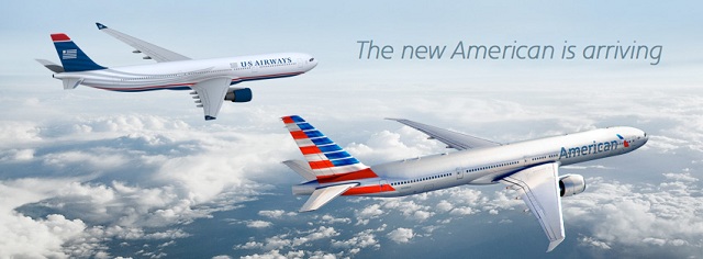
Many network, hybrid and low-cost carriers around the world have reinvented their paint schemes over the past few months, or have at least unveiled new design patterns, logos and brands to replace their current ones in the near-term future. The most notable carrier to recently announce a major re-branding campaign was American Airlines, who exposed its controversial new livery and logo in late January.
Paint schemes are a big deal. I mean, it’s what you see in the sky! I was driving the other day and noticed an American 737 on final approach into Chicago O’Hare bearing the tacky new livery depicted below. For the life of me, I just cannot bring myself to appreciate it! I literally am reminded of Cubana every time I see it.
When I was younger, I had an addiction to building model airplane kits. I would spend weeks constructing replicas of a Lufthansa 747-400 or an American Airlines 777-200ER, among a host of other projects. My grandmother would even voluntarily step in and assist when I would transition from assembly phase to the painting phase to insure that I had selected the proper colors for the various parts of the plane. After all, since I was younger than 18 years old, somebody had to buy the spray paint from the nearest Home Depot for me, so this was my way of paying her back (besides, adding on the decals was my favorite part at the end).
But in all seriousness, painting a plane is the trickiest part of all. The precision and attention to detail required really shed a whole lot of light onto how much thought goes into the end product.
Below is American’s new livery, and if you’d like to know my real thoughts about it, access the link above to hear my rant on how terrible it is.
Alas, there is more ground to cover, so let’s move on.
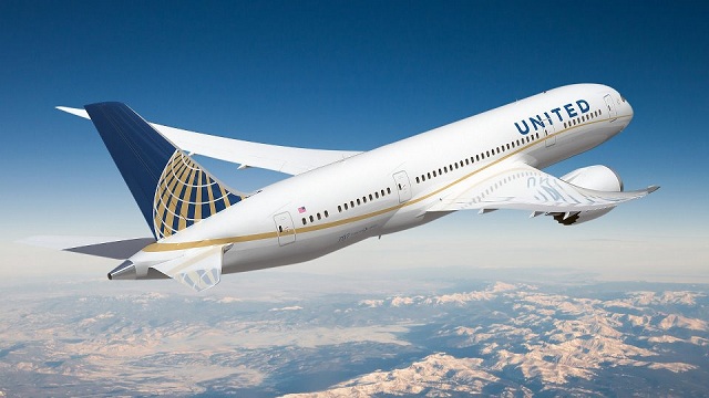
Although not discussed often, United has actually adopted a separate paint scheme recently applied specifically on their 787s by adding a gold “ribbon” swooping along the fuselage of the plane. The swoop is a Boeing trademark, and United is adopting it for the 787 as a tribute to the two companies working together.
I will be honest, this was not something that I recognized right off the bat. I was aware that All Nippon Airways had adopted various paint schemes for their 787s, but I’m happy to see that United is making some alterations. I still much prefer the United tulip over the Continental globe. The Continental globe is a bit too simplistic for me.
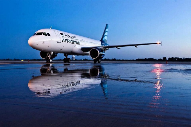
Another major game-changer has occured for Libyan’s national airline, Afriqiyah Airways, which previously had used a livery that displayed a series of “9’s” on its tail in relation to September 9, 1999 – the date the African Union was founded. This was one of Gaddafi’s major projects that ultimately did not go very well, and so the airline has adopted a new paint scheme since the prior version was too closely linked to his regime.
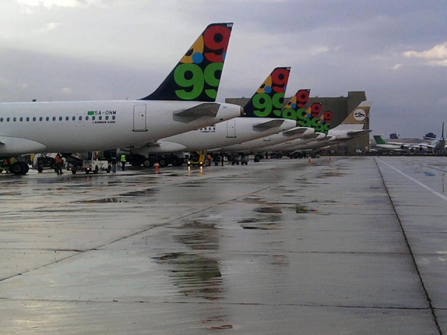
The new livery, in my honest opinion, looks a lot like Garuda Indonesia or Mexicana. While aesthetically pleasing, it is not what I would consider original. I do like the name “Afriqiyah” though. I probably won’t be flying them anytime soon though, although, never say never.
Sling-shotting over to Latin America, one carrier that has undergone a major rebranding recently is the state-sponsored Aerolineas Argentinas, a recent addition to the SkyTeam alliance. Aerolineas has struggled financially over the years and been laden with debt issues and fleet mishaps, amid a myriad of other problems. However, the airline has surged through with repainting its aircraft with a lighter blue livery which I find quite easy on the eye.
Compare and contras Aerolineas’ old livery (top) with its new one (bottom):
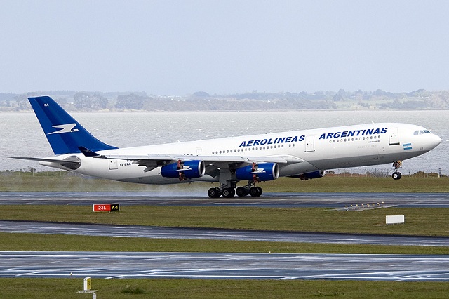
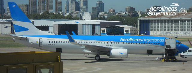
I’m a huge fan of the light blue and gray, as well as the adaptation to the logo on the tail. To me, this is the type of “subtle” rebranding that is effective. American should have followed in AR’s footsteps on this one instead of turning the silverbird concept and Eagle logo completely on their heads. C’est la vie.
A bit further north on the same continent, Colombia-based Avianca just recently let the floodbreaks loose on a new paint scheme in light of its recent merger with TACA Airlines. Individually, I felt that both Avianca and TACA had amazing paint schemes. Avianca’s resembled Asiana’s just a little bit, but the differences were obivous enough to give AV its own free-form identity. TACA’s livery also had an amazing “wow” factor that looked truly Central American.
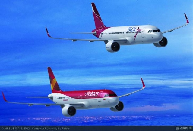
However, on Friday, it was leaked that the merged airline, in addition to dropping the “TACA” name from “Avianca-Taca” would also adopt a “hybrid” paint scheme that reflects some DNA mixing extracted from both airlines. Notice that the name is missing from the fuselage, but the Star Alliance logo is present, along with the new Airbus 320 “sharklet” wingtips.
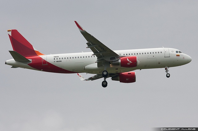
This is a bit of a downgrade, in my opinion, but I can see the rationale behind this move and why Avianca-TACA felt compelled to streamline the paint scheme as part of merger synergies. I guess what is saddening is that Latin American aviation has so many hit-or-miss stories, and TACA and Avicanca are both successful, well-managed airlines that have uniquely carved out niches in their home territories, both of which have been hotbeds of political controversy and violence over the years.
The next carrier that has recently undergone a controversial re-branding campaign hails from the European Continent. Low-cost carrier Germanwings, as part of its “new Germanwings” transformation which entails a closer integration with parent company Lufthansa, will transition from bearing a silver chrome livery (top picture below) to a white livery, and adopting a “W” ribbon on its tail (bottom picture below).
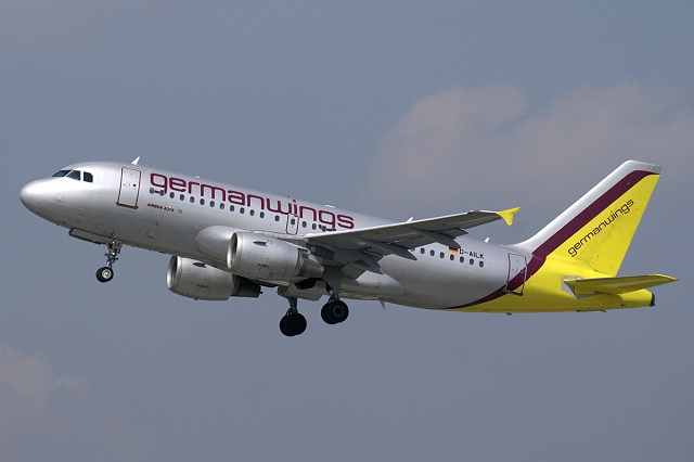
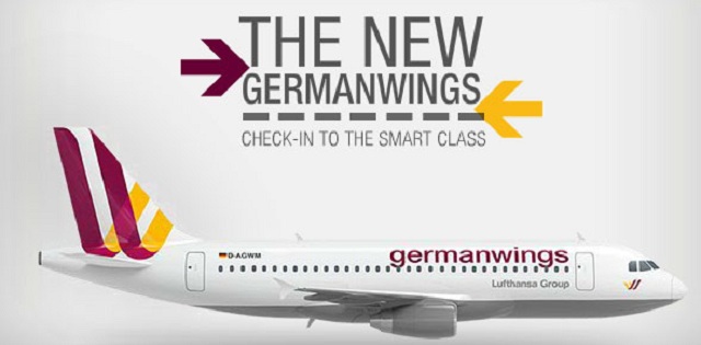
Indeed, the white fuselage and grey belly and engines mimic Lufthansa’s current paint design, and the ‘Lufthansa Group’ label pasted near the front of the aircraft is certainly a new feature. I personally think the raspberry title and ribbon formation with the yellow on the tail is nice, although some people disagree. These two colors blend better with white than silver chrome, that is for sure. However, I’m somewhat puzzled since only one of these colors (yellow) is representative of the German flag (red, black and yellow).
Finally, there have been rumors flying back and forth about Iberia Airlines of Spain and the dire need to repaint their planes. Iberia has been using the same design scheme since the late 1970’s, and some possible solutions that I think would be brilliant are featured below: 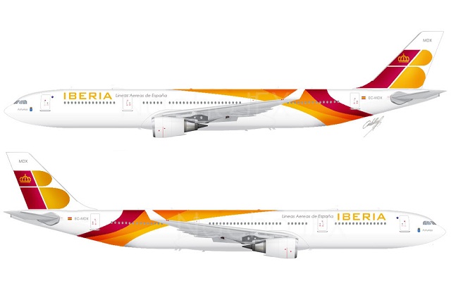
This is a small overhaul of the current scheme, retaining the red, orange and yellow pieces over the top of the fuselage as well as the logo on the tail, but in a more “wavy flag” like version, somewhat similar to what Delta used before it rebranded in 2007 back to the widget. I personally think that the title on this paint scheme should be in red, and should be enlarged to either be placed below the windows, or over the windows in a bigger font size.
Another wildcard idea is creating more unity with British Airways’ current paint scheme, which is the English Rose concept, since British Airways and Iberia are both part of International Airlines’ Group.
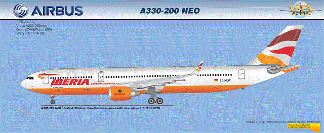
I actually REALLY like this idea. Again, I’d prefer for the paint on the underbelly and engines to be red instead of orange, but I think this is a really cool concept for their commercial fleet graphics.
Share your thoughts on these paint schemes in the comments below!

