Earlier this week I discussed the pros and cons of using two popular meta search engines to search for a hotel. Now let’s look at the flight there.
Like last time, I’m planning a hypothetical trip to San Francisco on May 18-21. Both websites remembered the dates from my hotel search, so it was only a matter of pressing the tab for a flight search instead. I was really impressed that Kayak’s results loaded almost instantly. As in, less than 2 seconds. Hipmunk took a little longer, but even 5 seconds is good.
First Impressions
The ads on Kayak still bother me, and they were still interspersed among the search results, but they seemed less intrusive than when I did my hotel search. Part of that may be because the ads were for hotels and could easily be distinguished from flights. That wasn’t as easy when both ads and results were hotels.
Hipmunk impressed me with its own version of the “time bars” feature that I’m so fond of using with ITA’s Fare Matrix, but it was barely fulfilling its potential beyond basic time information. Most airlines names were not included because the bars were too short to fit them, and hovering didn’t provide a name either. There was no color key. In fact, you have to click on a flight, and even then the airline’s name didn’t pop out at me until I read more closely. Earth to Hipmunk: Put the flight number in yellow to catch people’s attention!
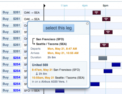
At least it told me which flights have WiFi (red means Alaska, btw), but as a United devotee I have never experienced in-flight WiFi and am not really sure what I would do with it if I had it.
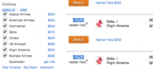
In contrast, Kayak’s results were a little more messy but gave me more convenient control over tailoring the search results to my taste. A box in the left sidebar provided me with the lowest fares offered by several carriers, which I immediately recognized as being competitive with Kayak’s overall cheapest results. Hipmunk would let me sort by carrier but not give me the price until after I had done so.
Winner: Kayak
Getting Clever
Did you notice that little “Hacker Fare” text in the Kayak results? This is a new feature to me, and apparently what Kayak is doing is trying to figure out if it can get you a better deal by purchasing two one-way tickets instead of a roundtrip. I actually approve of it’s use of the word “hacker” in the context of its disclaimer. This is what travel hacking is about, even if a $2 difference isn’t really worth the inconvenience or the loss of my United miles.
By combining two one-way bookings, Hacker Fares allow you to find cheaper flights and flight times that would not otherwise be available. Because there are two separate bookings it is important to verify fares and availability for both bookings before completing either purchase.
Both web sites had features to filter by airline or alliance, or to exclude red-eyes, etc. Although Hipmunk doesn’t necessarily share the sliding bars for departure and takeoff time that helped make Kayak such a hit when it first came out, it does integrate similar sliders into its “time bars” style search results. Black bars that run up and down either side of the page on Hipmunk can be dragged to limit the number of flights displayed.
Kayak doesn’t do that, but it does have a “pin” feature that has existed in one form or another for a long time. This essentially allows you to move that result to the top of your list so you can keep sorting for other alternatives. Perhaps two or three flights will each make you 90% happy, but they are mutually exclusive if you set certain limits or can only be found on different pages of the results, making them difficult to compare directly.
Winner: Tie
Flexible Dates
I’m usually a flexible dates kind of guy. Not necessarily any date, but maybe I know I want a weekend trip and don’t necessarily care which one as long as it’s in May. I really don’t like search commands that look for a weekend. They almost always define it wrong, perhaps giving me two-night options leaving on a Friday but coming back Sunday but excluding Friday through Monday even though the price drops by $50. This is one reason I like ITA’s calendar feature, since I can give it a range of nights and see quickly how the prices vary for different combinations over several weekends of different lengths. Kayak will do both weekend and calendar searches as well as +/- 3 days from the dates you entered.
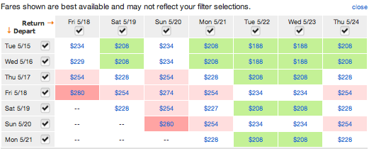
What I liked about this was not necessarily these options, which I think are better replicated in ITA, but that Kayak will also let you choose +/- 3 days after doing your original search without running a new one. As you can see, the results aren’t as good since they’re limited to what other people have searched for in the last 48 hours, but it’s a nice idea.
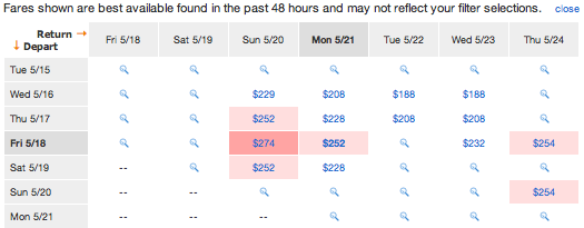
Hipmunk’s version of this feature is much clunkier. It displays a list of outbound dates and the best possible fare for each date, but it won’t show you the return options until you pick an outbound. In contrast, Kayak shows all of this at once so that if I know my return is fixed but my outbound is flexible, I can work backwards.
Winner: Kayak
Booking Flights
There isn’t too much difference here. While Hipmunk really annoyed me with its Airbnb results during a hotel search, that isn’t a problem with flights. No one’s created a site to list people willing to fly you between Seattle and San Francisco in their Cessna 172. …Yet.
You could argue that Kayak’s hacker fares could be mildly irritating in the same vein as Airbnb since they create additional results that make it harder to weed through the “real” results. But that was solved easily enough once I started setting some limits on the airlines I would fly. I couldn’t find a way to turn off Airbnb when searching for hotels other than setting an outrageous minimum price that I would never want to pay.
Once you find a flight you like, you can click on a button to connect you to the actual reservations site. Here, Hipmunk has solved a problem that bedeviled it with hotels and has provided links to the airlines’ own web sites. Unfortunately that’s all you’ll get most of the time. Sometimes I saw an Orbitz result or two, reminding me of Orbitz’s exclusive hold on Hipmunk’s hotel results.
Kayak has gotten less generous with the fare comparisons lately. It no longer shares the prices it found on several other sites. Now it’s pretty much just the airline’s price with links to Travelocity and Expedia if you want to search there, too. But that means another search, another series of tweaks to get the right flight for you. It will be faster if you only want to compare prices for one particular flight, but it is still annoying.
Hipmunk almost lost me when it offered to find me a hotel for New York even though I was flying to San Francisco, but I’ll give it a break. 😉 In this case, it seems both search engines are roughly equal.
Winner: Tie
Decision Time
Going by the numbers, Kayak comes up as the winner. But it’s close. Two of these competitions were tied, and Kayak only barely won the other two because Hipmunk made things a little more complicated than they had to be (but not impossible).
Personally I wouldn’t choose either. What this comparison test showed me is that there isn’t much benefit to using Kayak or Hipmunk these days. The original goal of a meta search engine, to go out and search multiple sites and come back with the lowest price, is no longer being fulfilled. Both search engines effectively gave me the same option from the airline itself and told me to book it there. If I wanted to search elsewhere, I had to do it myself.
This makes some sense. Discounts for air travel don’t really exist anymore, and the commissions paid by airlines to online travel agencies are dropping or already gone. These prices already are the lowest, and if an airline doesn’t give you the best price it’s usually due to a glitch or because of some particular way the trip was constructed (e.g., I’ve gotten lower prices by entering each leg separately as a multi-city itinerary).
What you’re left with are two websites that function almost the same as ITA. In fact, I’m pretty sure they get their data from ITA before reprocessing it and displaying it to you. That’s what ITA does, sell fare and inventory data to search engines.
If you can figure out how to use ITA’s Fare Matrix search engine, I think you’ll be a lot happier with the tools at your disposal to find the flights you want. You’ll have to actually go to the airline’s site to enter the information again when it’s time to book, but that’s the price to be paid. Even with Kayak and Hipmunk’s one-step button that links you through to the airline’s site, I regularly encounter price discrepancies from what I was promised earlier.
Fortunately I’ve created a walkthrough on learning to use ITA that is more detailed than what I was able to go over here. I know many of you have stumbled across it already because I’m fond of referring back to it, but I encourage you to check it out.

