When you’re a frequent flyer with a certain airline, one would expect that service, reliability, and value are among the most important factors. But just like driving a car, the paint job can say a lot.
Alaska Airlines has just announced a huge brand refresh — its first in 25 years. Although it made a few changes last year — smoothing out the lettering on its wordmark, dropping the “Airlines” in most instances, and refreshing some parts of the website — these were superficial and not always easy to notice. Other changes like its Alaska Beyond service with new digital media players, in-seat power, bigger luggage bins, and improved meals in coach were significant but didn’t do much to affect the airline’s appearance.
Today’s announcement changes the entire look for Alaska Airlines. Passengers can expect to see new planes, new signage, new credit cards, and more. If you fly through Seattle, Alaska will be spending tonight overhauling all their gates to create a brand new look on Tuesday morning.
Rumors about the customer event and livery changes have been circulating on Flyertalk for a few weeks. Airliners.net even has a teaser of the new gates.
Detailed Changes to Alaska Airlines Brand
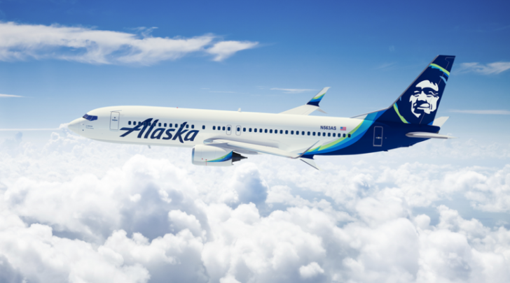
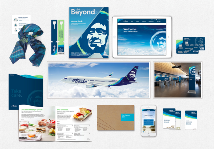
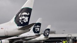
Some leaks made it to Twitter before the announcement, but here’s a look at the new livery including more colors, net lettering, and a refreshed version of Chester, the smiling Eskimo. It will affect all levels of Alaska’s branding including the credit cards, in-flight magazine, and even the scarves that employees wear.
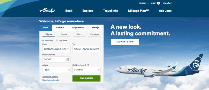
You can also see the changes to the website, which has already been refreshed. (I actually loaded the page too soon, and first caught it while down for maintenance.)
My Initial Reaction
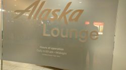
Alaska Airlines has always struck me as different. They weren’t aiming to be modern or progressive or flashy. They were trying to comfortable and friendly. The lounges that some people think are outdated? I think they feel like a Northwest lodge. The carpet on the bulkhead is odd but reflects the Native American culture in their home state of Alaska. Even the Eskimo has a little fun, sporting a lei on the flights to Hawaii. In the words of qukslvr619:
Perhaps I’m stuck in a 1993 timewarp but am I the only one that prefers the original jagged script wordmark? To me it seemed timelessly classic. I see it and instantly think of what Alaska (the state) and the Pacific Northwest represent…vast tundra of natural beauty, unexpolored frontiers, and the pacific ocean.
I want Alaska to improve its brand and stay relevant. I just agree there’s a risk that Alaska takes things too far and loses that local feeling. When they cleaned up the wordmark last year they added cleaner lines but kept the exaggerated lettering.
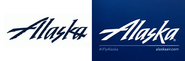
The wordmark revealed today is starting to look like an ordinary sans serif typeface, though you can see the evolution when viewing all three together. It’s still not as generic as most airlines so they appear to be treading carefully. With that in mind, here’s a video with some background on what Alaska was thinking as it made these changes:
Most people have an innate bias for the familiar. I still miss the tulip every time I fly United, so in that respect I’m very glad that Alaska kept Chester. I’ll reserve further comments until I see the entire look in person tomorrow evening where I’ll be at a reception for some of Alaska’s customers.
I’m curious to hear what everyone thinks about the big change, too. If you’ll be flying through Seattle on Tuesday morning, take a few pictures and send them my way with your thoughts!

