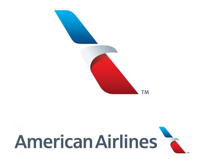
American Airlines revealed its new logo in 2013 around the time of the U.S. Airways merger. Unlimited Graphic Design options and unlimited creativity cause unlimited opinions and debates sometimes. There was a lot of dispute at the time, mostly around the aircraft livery being painted off-white with a massive striped tail. I thought the logo was, well, okay. It’s not like the old double-A was much better.
Apparently the United States Copyright Office was even less impressed. The final opinion is that “a mere simplistic arrangement of non-protectable elements does not demonstrate the level of creativity necessary to warrant protection.” (HT to USA Today)
By this they mean the use of sans-serif typeface followed by a diagonal stripe of color, with a small white streak that is meant to resemble an eagle’s head. American Airlines is in a tight spot because the red, white, and blue colors are not at all distinctive in the United States. The only decorative element is the shape of the terminal swoosh, not the typeface or the colors.
I don’t agree with the copyright office, even though I think the logo is boring. United’s current globe logo, taken from Continental Airlines, is even worse. And in United’s case they had a truly creative “tulip” that they could have kept.
But American Airlines isn’t in too much trouble. They still have a trademark on the logo, which offers lesser protection. A copyright would have conferred stronger rights. By analogy, the paper airplane in the “Travel Codex” logo could be trademarked, as it represents this blog as a brand. However, many other businesses and even other blogs also use a paper airplane. I acknowledge it is not creative and therefore does not deserve the protection of a copyright.
The bottom line is simply that the government called American Airlines boring, and that’s enough to make me smile.


