I’ve finally gotten Megan to start writing the occasional guest post. She is probably never going to be a travel hacker like me, but she does have a unique perspective on the places we visit due to her educational background. I’ve decided to call this series “Elevation” (a drawing of a face of a building with al the features shown, as if in a single vertical plane) because of the triple entendre spanning architecture, style, and flight. It will be about interesting buildings and other structures you might want to visit on your travels, and while I intend to publish these posts on Sundays, life happens.
When we travel together, Scott and I both enjoy the journey to our chosen destination. As is obvious from this blog, Scott is the one most dedicated to our means of getting to these places. My general rule when accompanying Scott on these types of trips is that we must stay at our destination longer than it takes to travel there round-trip.
One of the ways in which I explore our destination is through my background in architecture. I have both an undergraduate and graduate degree in the field, so you could say that I am pretty into it! But I’m still working towards my architectural license. (7 exams and a few months of work experience to go!)
A recent trip this summer allowed me to finally visit one of my favorite buildings, the Kimbell Art Museum in Fort Worth, Texas, by Louis Kahn. The reason it’s one of my favorite buildings is that it perfectly fulfills the function for which it was designed: a background to display art. While this may not sound shockingly revolutionary, it is actually rare these days that an art museum, especially one by a famous architect, actually allows the art to be the focus of the user experience. Many current museum projects have such big statements in the architecture that the visitors have a hard time focusing on the art itself in and around the building. (The museum has its own page on the building’s architecture.)
The Kimbell showcases the art in three ways: lighting the interior with indirect, natural sunlight; a simple layout to move between the individual galleries; and a masterful use of materials. You can see more images on the Arch Daily blog.
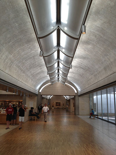
Though often overlooked, using sunlight to illuminate the building interior dramatically improves the space — an architecture buzzword. We still haven’t been able to reproduce the entire spectrum of sunlight in a light fixture. When looking at art, this means that not all the colors will appear as they were meant to be seen, instead being strangely tinted by the artificial light source.
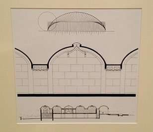
Kahn rigorously studied sections of the building through architectural models to understand how light would bounce off surfaces to indirectly enter the gallery. The use of indirect as opposed to direct light is also important because the direct light would damage the art, degrading the paint. Direct light would also lead to glare that would also make viewing art in the galleries uncomfortable for visitors’ eyes. See the drawing below to see how Kahn was able to bounce the light around on the roof before it enters the galleries.
Additionally, the layout of the building allows visitors to meander through various galleries while still understanding their location in the museum as a whole. I would describe the building organization as a collection of long bars, and the galleries each take up portions of the bars. Each of these bars is an extrusion of the daylight system so that the daylight comes into the building from above along its entire length. You will notice that there are no hallways in this building as Kahn was able to so efficiently lay it out that no space was wasted on a corridor.
Also important are the small pocket courtyards that open up off of the galleries. These courtyards allows visitors to step outside for a moment to take a break, sit down, make a phone call, etc. The size of them is also very nice as it allows only a handful of people to occupy them at once.
Finally, Kahn composed the building with a simple palate of materials: concrete and travertine. Because the building is entirely of neutral colors, it fades into the background against the art. The concrete does the structural work and the travertine is an infill material to create enclosure. However, the travertine used in the building has an interesting texture, and I kept finding myself wanting to touch it while I was visiting.
Kahn also masters the transition points between different materials. Throughout my architectural education, I have frequently been told and experienced as a professional that much of the architecture happens in how materials, structure, other components of the building ultimately are connected together. The test of success is when you look at a transition, and cannot think of it happening any other way. That usually means that the Architect spent an enormous amount of time, effort, and strife to get it to be that simple and beautiful. Kahn is one of the best at this.
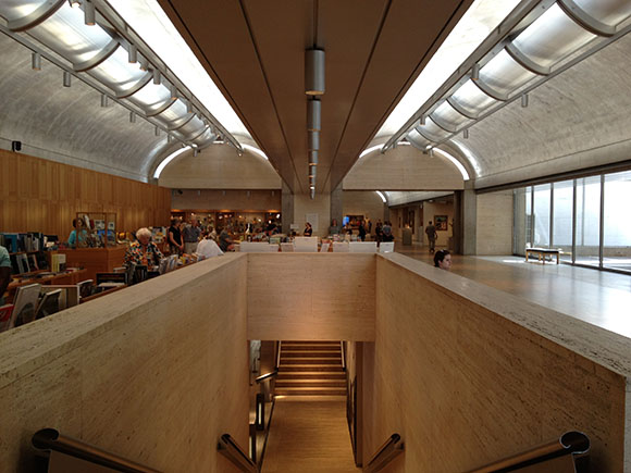
The Kimbell is special because it is not a loud building. When seen from a distance, nothing stands out, but once inside the building, it inspires meditation. Kahn uses his entire kit of architecture parts to sculpt with daylight inside the building in a way that makes the visitor understand the art even more.
There is a new addition designed by Renzo Piano currently being built. It is interesting to note that the addition will in no way connect physically to the existing Kimbell. The addition will be across a green open area, and create an excellent park for the two buildings to share. I look forward to returning to visit once the addition is done!

