It has been more than 6 weeks since I’ve been on a plane. I miss it. Inspired by my friend Matthew, here is a list of some favorite airline liveries. My father traveled fairly often when I was growing up, and trips with my parents was likely what started my wanderlust. I fondly remember conversations with my dad about how to tell the difference between a models of DC-9s. Yes, a child of the 1980s.
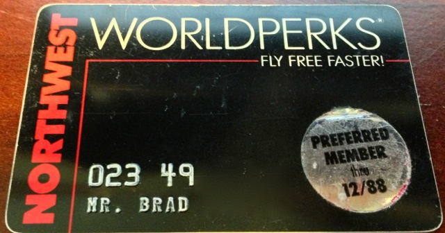
In this post, I’ll talk about some of my favorite airline liveries, focusing on the formative years of my travel. I even earned my first elite status in that decade.
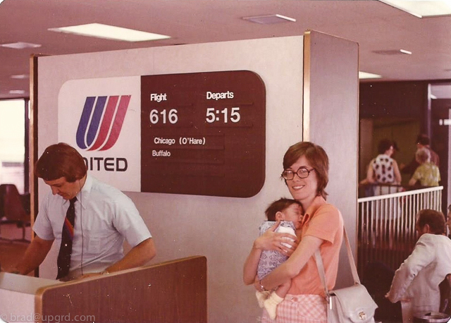
To really look back, it should be my first flight. A flight on United Airlines with the classic Saul Bass logo. His designs are a recurring theme in my list, as you will see.
On to my top 5 favorite airline liveries from the 1980s. In no particular order:
Northwest Orient Airlines
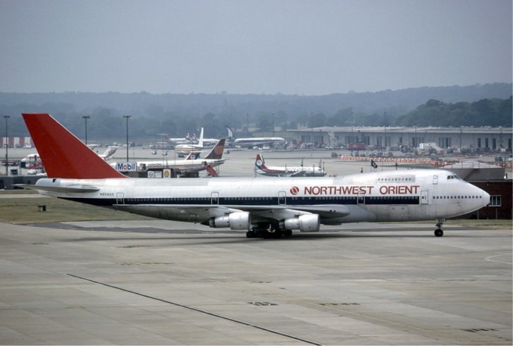
I flew on Northwest frequently as a child, and the livery above was standard for most of the 1980s. This livery is rather plain, but the bare metal earns points for simplicity and for fuel efficiency. I remember various trips around the US, including to Hawaii a few times. Back in those days, Northwest occasionally flew widebodies to Hawaii, and at least once, we got upgraded to first class for the (to me at the time) long flight. It was a cozy recliner chair in the nose of a 747. A far cry from today’s flat bed seats in premium cabins, but a very pleasant way to fly to paradise. Mike wrote a trip report about his flight on one of these birds in 1986.
Republic Airlines
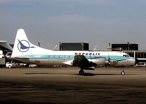
Being a midwesterner, Republic was another common site in my travels. I vaguely recall flying a Convair 580 as shown above at least once. I think we were visiting my grandparents in Nebraska. Republic has the blue duck logo on tails, affectionally known as Herman. North Central and Southern Airways merged in 1979, and Republic was born. Republic eventually became part of Northwest, when they dropped “Orient” from their name.
Continental Airlines
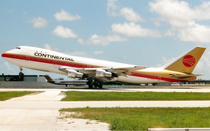
As a young child in the 1980s interested in aviation, I was fortunate to have a relative in the business. My uncle worked for Continental when they were based in Los Angeles. I still have some various swag he gave me. All of it with that classic jetstream logo. Designed by Saul Bass. I don’t think I flew Continental in the 1980s, if I did not much at all, but the logo is memorable to be. What a classic look.
Alaska Airlines
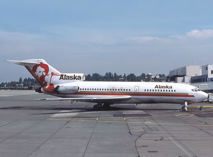
While these are all sentimental to me, like Continental, this one is thanks to my Uncle. After Continental moved to Houston, he moved to Seattle to work for Alaska. He kept sending me airplane swag. I remember various items he sent to me with Alaska logos. Back in the day Alaska didn’t have only the eskimo on the tail. While the above photo is from the 1980s, most Alaska planes have carried the Eskimo livery (initially stern and since smiling) since the 1970s. Had to include a 727 in this list as well since it is a workhorse of many airlines in the 1970s and 80s. For more history of Alaska Airlines liveries, click here.
Frontier Airlines
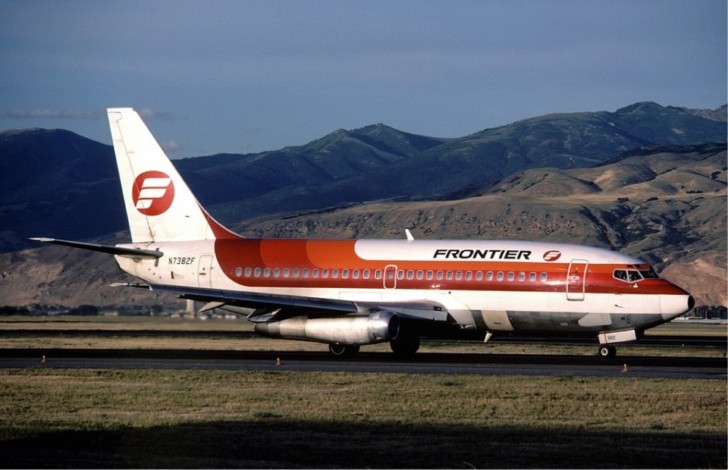
Frontier from the 1980s is not the same airline as the current version, although both are based in Denver. The original Frontier went out of business in 1986. My memory of Frontier is a flight as a young child. I don’t remember much about it other than the fact that we flew Frontier at least once. Looking back, I’m struck by the logo, and not surprisingly, it is another Saul Bass design.
Final Thoughts
I’m very much dating myself here, but I hope you enjoyed this trip down memory lane as much as I did. These logos definitely look old today, but I think that’s because none of them have flown in many years. I find many of the designs timeless. These are 5 of my favorites, all from the 1980s. I’ll likely revisit other liveries that I like in a future post.
What other favorite 1980s airline liveries am I missing?

