Last week, I discussed some former airline liveries from when I was growing up, specifically, the 1980s. Now, I’ll share five more favorites that are more recent, but also no longer current. There seems to be an unintended theme here. Many of these images are on 747s, always a favorite plane of mine. I’ll start this post as I did my last one, with a reference to an airline that is no more. I flew Northwest a lot growing up, and it was the first airline I flew routinely when I started travel for work. At the time, it was the best option for my needs, and being based in the midwest, had good coverage where I needed to go.
Northwest Airlines final livery
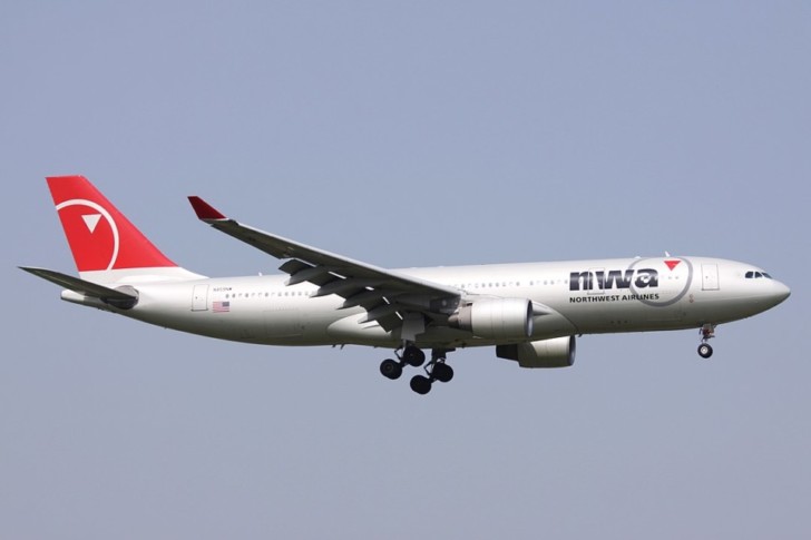
Some of these Northwest planes are still flying for Delta today. Most Airbus planes in the Delta fleet used to fly for Northwest in these older colors. I really liked the final NWA logo and livery. Simple and distinctive paint scheme, and the logo is so simple, denoting a compass pointing Northwest. Of course, that doesn’t work so well half of the time, as seen above, the arrow is pointing northeast. Delta references this design concept in their current look, with the Delta widget pointing at an angle, to the northwest.
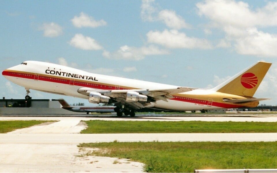
American Airlines Luxury Liner
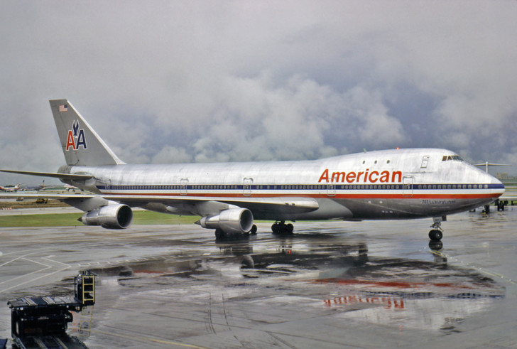
This is one that has grown on me in part just for its simplicity. I don’t mind the current branding, but the tail design is still not a favorite. I can’t help but think of Cubana. This older design, in use from 1967-2013 certainly looks old, but the bare metal is more efficient, with less fuel burned carrying thousands of pounds of extra weight in paint on each flight. Not to mention, this is, to me at least, a classic look. Lots of bare metal on a 747! Granted, this look wouldn’t work on modern composite airplanes such as the 787s. No bare aluminum to polish on the fuselage.
Japan Air Lines Tsurumaru
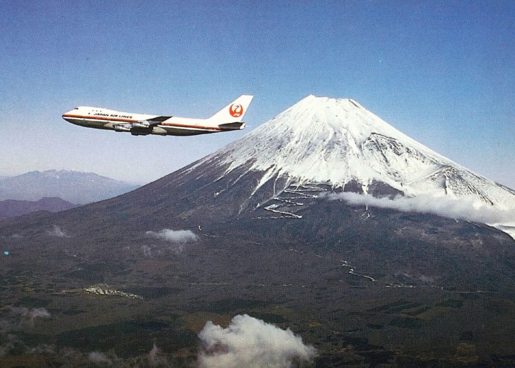
While I find this overall scheme quite dated, the crane tail logo is iconic. So much so, JAL has gone back to using a similar design in their current branding. The use of the crane, called Tsurumaru, wings up in flight, making a red circle on a white field, which evokes the Japanese national flag. The crane is known for loyalty and long flights. Excellent design and ideal messaging for an airline.
Lufthansa/Fanhansa Siegerfleiger
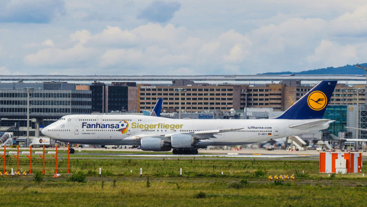
Lufthansa is changing their livery to a slightly new design, mostly just removing the gold accents. The result is what I personally find to be a very bland look. Not fancy, but I enjoy the former design of Lufthansa’s fleet. The above photo shows a special scheme that lasted for a few years. During the 2014 World Cup, Lufthansa painted at 747 with the Fanhansa scheme. Then when Die Mannschaft won the competition, Lufthansa added Siegerflieger. (My German language skills are poor, but I interpret this as “winners plane”). I never flew this particular plane, but I did see it a few times when it was painted like this between 2014-2018.
United Rising Blue
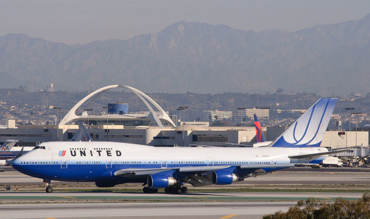
I couldn’t make another list of former airline liveries without including another Saul Bass design. I mentioned this in my last post, but Rising Blue didn’t fly in the 1980s. Anyway, I’ve flown more miles on United than any other airline, so there is some nostalgia here. I love the classic tulip design, and the Rising Blue paint scheme has both the original tulip, with a modern looking tail design. This one is an all time favorite of mine. The newest United look is better than the what it replaced, but pale in comparison to this gem.
Final thoughts on these former airline liveries
These former airline liveries are some of my favorites. They are all gone now, though, Lufthansa is taking its time repainting its fleet. Still, many of us should remember these, as most of them are relatively recent.
What former airline liveries did I miss?

