A few weeks ago I compared Kayak and Hipmunk, two leading search engines for flights and hotel search online. For today’s post I’ve taken a look at Google Flight Search after its recent update to include international fares. (I’m also working on an update for my Hipmunk walkthroughs in the near future.)
Google Flight Search got a lot of badmouthing when it first came out. It’s the offspring of Google’s 2011 purchase of ITA, the creator of the Matrix search engine. I still consider ITA the standard bearer for those who can figure out all its coding tricks, but Google has been trying to create a simplified version that works better: more intuitive, faster, and easier to sort through when it spits out 10,000 results. Although Google releases a lot of products with the “Beta” label that it claims are still under development, they usually work pretty well from the get-go. In the case of Flight Search, it has been very obvious that changes will be made incrementally, and it’s more of an Alpha release–an earlier version of software that still lacks final design features.
For example, the first iteration of Flight Search didn’t search international flights and was somewhat awkward to use despite a few clever tricks. I remember using Flight Search back then but don’t completely remember everything since it was a one-time visit. I’ll base most of my description on Version 0.1 from a review Frequently Flying wrote back in September that called Google Flight Search “a total disappointment.” Significant changes have been made, and I’m not sure how many of them were actually around back then but overlooked. Still, I think Flight Search is only at Version 0.2 today. But what a Version 0.2 it is! I think Google Flight Search (GFS from here on) has a lot of potential, and it could be a game changer for experienced travelers if Google chooses to incorporate some of the advanced routing language options from ITA.
Domestic Search Results
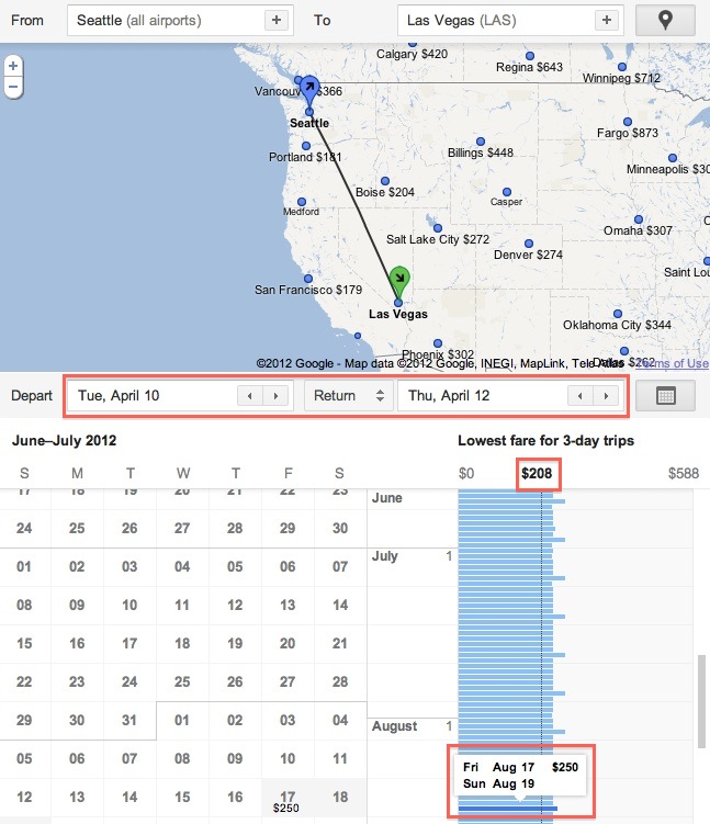
This has been around since the first release, but I’m going to describe it anyway. Google manages to figure out your current location based on your IP address and assumes the nearest airport is your origin. You can change this, but it’s one less step for most people. Just input your destination in the next window along with some dates, and you’ll be ready to go. What I really like about GFS is that the map and results are all on one page, a page that never reloads. Not that it needs to since results are delivered almost instantly. 😀
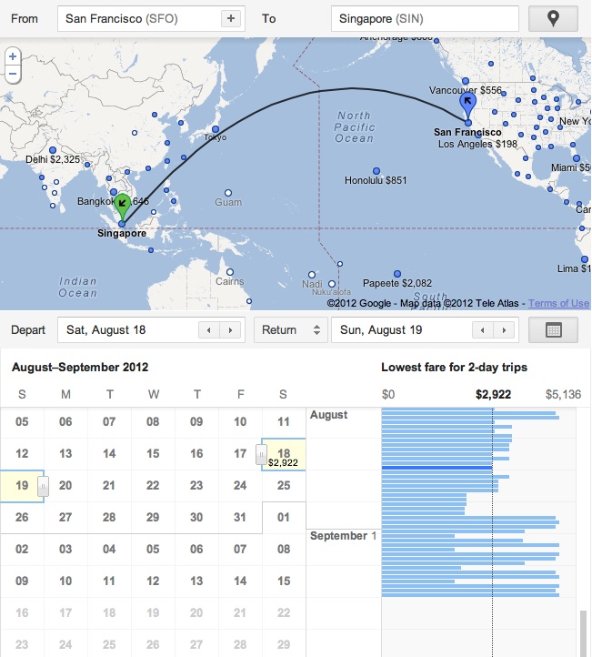
You’re shown a map of your origin and destination airports along with several alternate destinations and their respective prices. I’ll get back to these later. For now I want to focus on the the calendar feature. I love using this with ITA because I am almost always flexible with my dates. And if you’re not flexible, with GFS it doesn’t really matter–it’s still just as good. Click on the calendar icon to bring it up after entering your information. Ignore the normal-looking calendar that appears on the left and look at the column of fares on the right. If you searched for a 3-day trip to start (April 10-12) then it will show you the lowest price for the same 3-day trip on every other day of the year.
The vertical black line indicates the price for the departure date you originally selected, but you can change it by double-clicking on another blue row to indicate a new baseline for comparison. Scroll through the column of fares with your mouse or the scroll bar to see how prices change with time.
Poor Filtering and Purchasing Features
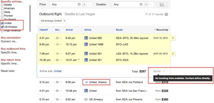
Unfortunately the fun stops there. You can select specific airlines on the right like with any other flight search engine. However, they don’t work quite right. I was still getting fares that included Alaska Airlines after limiting my search to United Airlines and US Airways. I guess I wasn’t bothered too much since it still narrowed things enough to find the flights I wanted. Sort-of. GFS doesn’t provide any aircraft information, which is important if you want to estimate your chances of an elite upgrade, want to get a newer aircraft with better in-flight entertainment, or are trying to avoid a regional jet. In this case, the only warning I was given is that my original return flight included the dreaded “… dba United Express.” I guess that’s something.
Picking specific flights is simple enough. Scroll through your options for an outbound flight, pick one, and the results below will automatically change to reflect your return options. If you don’t like the outbound or return, click on the X to eliminate it and choose another. It works pretty well with two caveats. First, if you eliminate the outbound flight, it also loses the return flight. At least ITA and Kayak will hold the return option for you and let you change just the outbound. Second, because the page doesn’t reload and the results, in my opinion, don’t have very clear graphical separation, it’s a little hard to tell when the outbound flights are replaced with return flights. It just happens in a flash. I dunno, just slightly bothersome.
More damning is the inability to book anything. GFS has only limited partnerships with a few airlines as well as Orbitz. To make things more complicated, most airlines *cough* American *cough* won’t play ball if Google is going to throw an online travel agency like Orbitz into the mix. They want to be the exclusive purchasing option. Things are crazy enough that you shouldn’t rely on actually being able to book your flight once you find it.
International Search Results
So far GFS has only a limited number of international destinations available. Something like 500, which is nowhere near the thousands of commercial airports in the world with IATA codes. Oh, and you also have to begin your trip in the U.S. Riiight. I’m sure this will be one of the first limitations to go, but my understanding is that Google doesn’t want to provide incomplete results for any given airport. It’s a lot easier to get all the data for Mumbai compared to, say, Nagpur. And if GFS only has a limited number of international destinations to work with, I assume using the same small set for originations may leave some users disappointed. Better not to let them use it at all than give them a bad experience.
It’s still a little finicky. For example, flights from San Francisco to Singapore apparently don’t exist after mid-September. That’s an awfully close-in limit given that schedules are usually loaded 330 days out, but maybe I had a glitch in my Internet connection and they just wouldn’t load.
A Creative Approach to Price and Time Filters
Everything I’ve described so far can be done better with other sites–although I still think the scrolling price calendar is nicely done. We’re now getting into the nitty gritty technical stuff that makes GFS fun for a travel hacker like me.
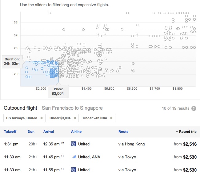
Underneath the calendar you’ll see two entry fields for Price and Duration. You can override the autofill and put in your own limits, or you can represent these limits graphically by clicking on the icon to the right that looks like a scatterplot (a graph with lots of dots). One of the things that Darren ragged on GFS about back in September is that these sliders for price and duration are too complicated for the average user. I agree. But since I do know how to use and interpret them, I would prefer that they stay the way they are.
Drag the Duration tab up and down the y-axis to exclude excessively long trips, and drag the Price tab left and right along the x-axis to exclude those you can’t afford. This creates a blue shaded area that limits the flight results below. What about all those dots? What do they mean? Hollow dots are flights that are already excluded by other criteria. For example, maybe you told GFS to only show flights operated by United Airlines. Solid dots are those flights that remain, but you will only be shown the flights that are both solid AND within the blue box.
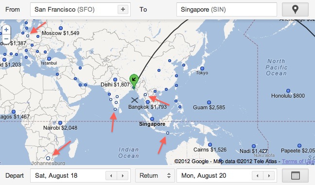
This solid/hollow distinction is important because it also shows up on the map if you pay close attention. This is where it gets cool. If you never set a price limit, all of the dots will appear solid because they all fit your search parameters. We see the actual flight you want to Singapore as well as alternate flights to other cities. Some of them even have prices. Hey, Bangkok is only $1,793! I should go there instead and save some money.
It turns out that once you set some limitations, some of the flights are going to be outside your blue box, and that means they show up as hollow dots on the map. If your limit is $3,000 then every alternate destination on the map below can be reached for $3,000 or less. All the hollow dots cost more than $3,000. I’ve indicated the hollow dots with red arrows.
This graphical representation of prices also works for domestic flights. So if you were to set a limit of $200 and specify only United, or only American, or whatever your preferred airline is, you would be shown a map with solid dots for every city at or under your price point. Ta-da! We have a potential replacement for things like FareCompare’s FlyerTalk tool, which used to do something very similar, showing you in text rather than pictures where you could fly for cheap to work in a mileage run or two. Of course, GFS doesn’t show all the airports in the US or the world if you zoom out really far. I guess you’ll have to go region by region. It also doesn’t quote you a price-per-mile, but most of us already know approximately how many miles you can get out typical city pairs and what a good all-in price would be. Still, it shows promise, and it does it a heck of a lot quicker than a manual search using ITA.
Finally, I just want to point out that you can drag and drop the blue and green icons for origination and destination airports. Like Google Maps, you can play with the map itself to make changes more intuitively. If that fare to Bangkok really appeals to you, just drag the destination icon from Singapore to Bangkok, release, and the individual flight results below will automatically repopulate.
Closing Thoughts
Google Flight Search has a lot of neat features that I never noticed before either because they’re new or because all its other failings kept me from paying attention to the things Google got right. I think GFS deserves some attention as a graphical complement to the ITA search engine we all know and love. Working with maps, scrolling calendars, and instantly updated results makes it so much faster to look for the flight you want. However, it’s still just a search engine. The booking process is so hobbled that I can’t recommend it as a replacement for Kayak, Hipmunk, or one of the OTAs. It is, like ITA, just a place to search for a flight that you will then book elsewhere.
Do you need ITA at all? Yes. GFS is only a suitable replacement for the most popular routes that Google has decided to include. There are also enough bugs when you try to limit your results to specific airlines and such that I don’t complete trust the results. Finally, ITA still has many features that make it great for complicated trips where you already know half of what you want and are trying to nail down the rest. ITA features like time bars and advanced routing language are essential when I want to book an international trip or need to go to a semi-rural airport with the potential for long layovers and inconvenient arrival/departure times. But keep in mind that changes are still coming. I can only imagine how powerful Google Flight Search could be if they decide to incorporate some of the best parts of ITA.
If you want to learn more about using ITA, read my walkthroughs:


