I haven’t talked much about hotels on my blog so far. Usually it’s the airline status I’m concerned about, so I’m all about how I can fly the most for less. As for hotels, I either have family or friends to stay with or sometimes go for the cheapest option on Hotwire.
But I do like knowing exactly which hotel I’m booking when it isn’t too much more expensive. Since hotel status is not something I can really expect to achieve right now, I don’t often check the hotel websites directly other than to see how good a deal I can get with my 10% Costco discount at Hyatt. This is an important thing to remember if you actually do want hotel status. You often need to book directly with the hotel in order to get stay and night credit. (Earning points doesn’t face the same complication.)
For those people, a service like Room Key works by searching the hotel websites and then directing you to them for the actual booking. You won’t have to worry about getting credit.
If that’s not an option, and you really must rely on the discounts offered by online travel agencies (OTAs) like Orbitz, Travelocity, and Expedia, then you have several options. You could go to those OTA websites yourself and perform several individual searches, or you could use a meta search engine like Kayak or Hipmunk. One search on these sites will result in many searches on several other sites.
The key questions become:
- Which site collects the most results?
- Which site makes them easier to sort through?
To evaluate these Kayak and Hipmunk, I did a dummy search last night for a hotel in San Francisco from May 18 to May 21 for one guest.
Displaying Hotel Results Efficiently
Let’s start with question #2. I’m very used to Kayak’s search results, which include a list of the available hotels and their TripAdvisor ratings to start and then require you to click on a separate link to view them on a map. The inclusion of TripAdvisor is great since I consider them one of the best authorities on service quality when it comes to hotels and restaurants. (Yelp is good for domestic restaurants, but I don’t use it internationally or for hotels.)
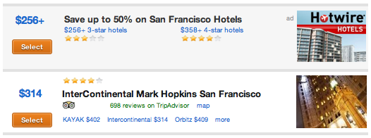
I don’t like that Kayak has started including ads from Priceline and Hotwire directly in the search results, though I can understand why it would from a business perspective.
Hipmunk begins with the map and a sidebar that lists the hotels and their TripAdvisor ratings. It’s incredibly simple and unassuming. Like Kayak used to be before it became a little too busy with ads and that new dark background.
I also liked how the results were displayed on the map when using Hipmunk over Kayak. When I originally had the idea for this post back in December, Kayak was still using it’s old display format, giving each hotel its own icon at its exact address, creating a lot of overlap in dense urban areas. This is a problem because all you can see is the top icon and you won’t know how many hotels are really there without zooming in. It has since moved closer to Hipmunk’s model.
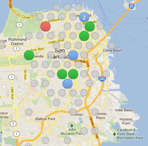
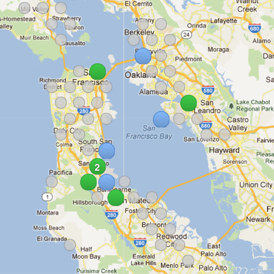
Hipmunk presents its results as a modified histogram, a form of graph that “bins” nearby data points so that you can estimate the frequency of results. Instead of a circle for each hotel, you’ll see a circle for a grid hexagon (circles pack tighter into hexagons than squares), and hovering over it will display the hotels within that grid region. Icons don’t get any bigger as you zoom in. Instead, they split up into smaller and smaller bins until each icon actually does represent a unique hotel.
Ta-da! No more problem with overlapping icons. Combined with the easy zoom feature on my Mac’s mousepad or the scrollwheel on your mouse, and it’s pretty easy to go in and out of different geographic regions of interest.
But like I said, Kayak is now more like Hipmunk. The only catch is they didn’t do it quite as well. Instead of binning search results according to a grid like Hipmunk, Kayak seems to be grouping according to neighborhoods or cities depending on the view. This gets very annoying the further out you zoom.
I don’t find this very helpful. Cities and neighborhoods have variable shapes, and putting a single icon at its center doesn’t really tell me much. The grid system Hipmunk uses provides a much more accurate approximation of location.
The problem is that all those dots indicate a lot of places I don’t want to stay. Hipmunk includes Airbnb in its search results, a service that connects you with people willing to rent out their room or apartment for probably less than a hotel. That just doesn’t sit well with me. I’ll put up with a crappy hotel to have my own space and not be living with a stranger. Hard as I tried, I couldn’t find a way to exclude Airbnb from the results. I also couldn’t sort by price. The only option was to use Hipmunk’s three categories of cheap, average, and expensive, which are chosen by Hipmunk, not me.
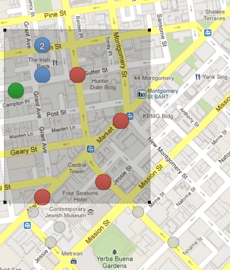
Hipmunk keeps coming up with creative ideas that earn a second look from me. This includes a box you can re-size around any region of interest so that the sidebar only includes a subset of the hotels shown on the map. Maybe you really only want to stay in a narrow strip along a busy street. Now you can highlight that region to only see those hotels. A small thing, but a nice thought. I find it a lot easier than Kayak’s radius feature, which is more difficult to use for defining arbitrarily sized regions.
Still, I can’t forgive its shortcomings in basic features like sorting by price. Kayak seems to be learning from Hipmunk and improving its own site. I think Hipmunk has a lot of promise, like that creative kid in college who had awesome ideas but couldn’t manage to write a decent essay, so hopefully they’ll also learn a few lessons from Kayak that have helped it earn its dominance.
Winner: Kayak
Including Information on Nearby Attractions
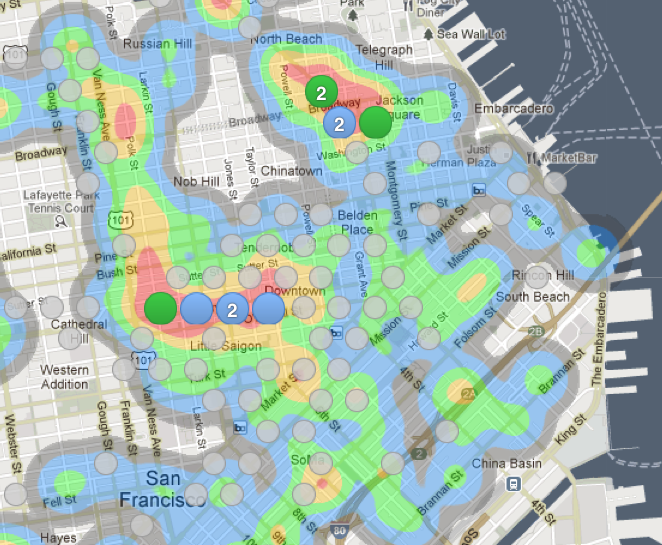
Hipmunk also provides heatmaps of nearby attractions like restaurants, shopping, and bars. A heatmap is just like the national weather forecast you see on the news or in the newspaper: gradients of color indicate how common certain amenities are instead of how hot or cold the weather is. (Hipmunk’s hotel icons are another form of heatmap, just with dots and numbers instead of color gradients.) Here’s an example for the distribution of bars in San Francisco.
Both sites let you specify certain amenities at the hotel itself. This isn’t so new and is not necessarily something I care as much about since I generally confirm exact amenities at the hotel’s website.
Winner: Hipmunk
Providing a Wide Range of Choices
Now for the bad news. Kayak is just so much better and providing you with information about the lowest price. Hipmunk pretty much had prices available from Orbitz and Airbnb,. The inclusion of Airbnb is nice in that it provides a non-hotel alternative that may be cheaper, but like I said earlier, I couldn’t figure out how to turn it off.
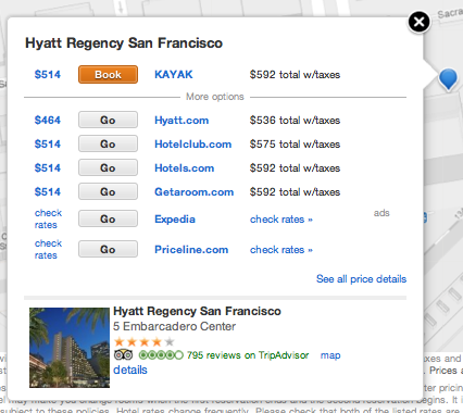
With Kayak, you can automatically search several other websites such as Priceline, Hotwire, and Expedia in different windows at the same time as your Kayak search. I don’t like to do this because I only want to search Kayak. I’ll get to those other sites later. Although Kayak didn’t return results from Orbitz, it gave me options from several other OTAs as well as from Hyatt.com (so I can get my stay and night credit).
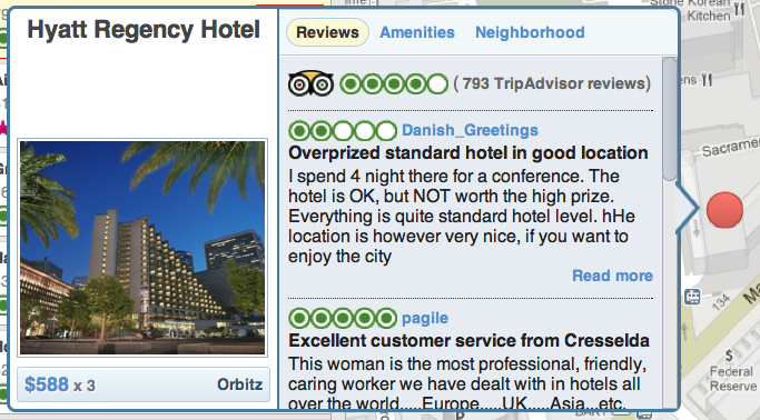
In my limited test of prices for the Hyatt Regency Embarcadero, Kayak was by far the better option. A few of the OTAs offered somewhat lower prices than the quote from Orbitz for $588, but Kayak also hooked me up with Hyatt itself, which had the lowest price of all at only $536 after taxes. If Hipmunk can’t even check with the hotel to see if I can get the lowest price AND my credit toward elite status, that is a serious fail in my book.
Winner: Kayak
Decision Time
At the end of the day, what do I recommend? Like any good hacker, you might have to use both of these tools for the best results. Start with Hipmunk to figure out the general region where you want to stay and even narrow it down to a few hotels. However, I wouldn’t use them to actually book anything. Prices frequently vary between different OTAs and hotel sites, sometimes a lot and sometimes a little. I don’t want the risk that I’ll get screwed just because I can’t take the time to double-check my results somewhere else.
Repeat your search with Kayak. Now that you know what you’re looking for, picking your way through Kayak’s relatively messy results will be easier, and you’ll have more confidence that you are booking at the best site.
Even though Hipmunk only won one out of three challenges, it succeeds at thinking up creative ways to present the myriad choices facing the consumer. More and more, I think tech companies are realizing that the key to innovation is not faster and cheaper but better. I still use Kayak because it gives me more confidence that I’m getting a better price. However, I wish it had some of the features that Hipmunk has, which ought to be a giant warning sign to Kayak. I used to wish my PC had some of the features I saw in my friends’ Macs, and in the end I just bought a Mac myself.
I miss some things about my PC, and maybe you’ll find that using Hipmunk is good enough to give up some features you liked in Kayak. But Kayak has already started moving into Hipmunk’s turf. Sad as it is to see a new company fail, I think Hipmunk has to decide if it wants to be serious about its competition with Kayak. It has to expand its search results to offer more confidence to its users that they are getting a great deal. Otherwise Kayak will eventually copy the best features from Hipmunk and will continue to sail on undisturbed.


