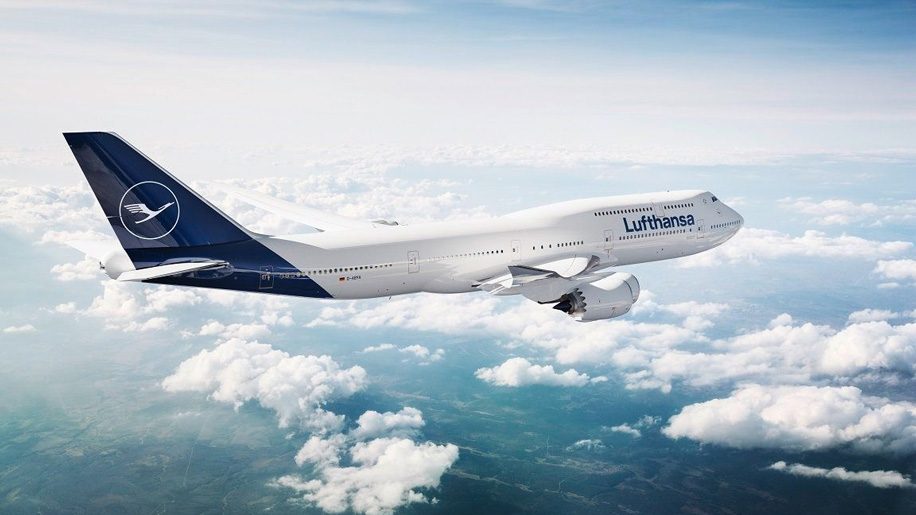
This morning Lufthansa revealed that it will be changing its livery to a new design. As one of the largest carriers in Europe with many international flights, it’s an easily recognized carrier around the world with an iconic look. Rumors in recent days left many people curious what the new look would be.

There are two key differences, and one more subtle change. First, the blue paint in the rear will extend beyond the tail structure itself and onto the fuselage. This seems to be more common now than it used to be as many airlines are revising their paint schemes. Alaska Airlines and American Airlines are both examples. The blue color appears to have subtly changed to a brighter hue, while the typeface is unchanged. (HT: Business Traveler)

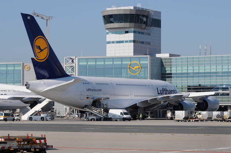
I’m more bothered by the loss of the yellow accents. The yellow crane on the tail was one of the most distinctive things about Lufthansa. The contrast was eye catching, and I think it added a very sophisticated look. Now the aircraft will feature a simple white/silver crane. Lufthansa’s Twitter team is calling the look #LufthansaBlue.
Overall the look is more muted, and I think I would have more trouble picking out a Lufthansa plane at a crowded airport. I certainly wouldn’t be able to spot one from the ground. The yellow also looks great in crew uniforms. But Lufthansa still has pretty good service and excels at getting people from A to B. That matters more than paint even though I wonder why they felt the need to change a good thing.


