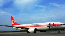
A few weeks ago, I wrote a blog post about new global airline liveries, logos and paint scheme redesigns over the past year, and assessed the good and not-so-good appearances which have been adopted and applied.
Recently, I stumbled across a thread on airliners.net titled, “Air China’s Extremely Outdated Livery” which really got me thinking about how there is a pretty extensive list of global carriers out there who could use with a bit o’ touch-up paint jobs. Or, just need to be sent back to the drawing board.
To get a glimpse of what the poster wrote,
China is booming, its private Airlines have more or less colourful new liveries. Only the flag carrier stays in the dull ages of communism.. I think that Air China’s livery has the most oldfashioned [sic], obsolete livery out there of any flag carrier worldwide. Why don’t they change? Has the design been created by Mao himself or what?
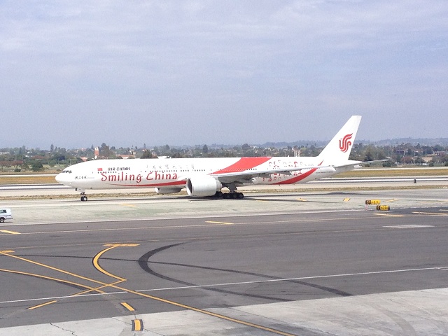
I have seen a special-themed Air China plane, which I spotted at LAX on a layover a few weeks ago. The enterprise logo on the Air China tail features an artistic Phoenix pattern which is actually the name of the airline written in calligraphy by former national leader Deng Xioping, as well as an artistic transfiguration of the word “VIP” (according to wikipedia).
The Boeing 777-300ER seen below is a special livery that features the words, “Smiling China” as part of a joint creation by Air China and Boeing to mark the 40th anniversary of Boeing’s entry into China. On the plane, there are 40 smiling Chinese faces with the intention of portraying China as a “friendly and optimistic airline.” This is the 10th Boeing 777-300ERs delivered to the government-owned carrier.
I will agree, however, that the regular Air China paint scheme is indeed pretty bland. Sadly, this seems to be a trend among a series of North Asian carriers that have stuck to the same paint design schemes over the past few decades without adding newer, bolder changes to jazz up their appearances.
Asian superstition?
A few years ago, I remember reading an article somewhere about how Japan Air Lines made a controversial decision to bring back its old crane livery, known as the tsurumaru (crane circle) which features a Japanese red-crown crane with its wings extended in full flight.
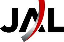
In the early 2000’s, JAL had completely revamped its corporate identity to include a new “Arc of the Sun” design that I thought was extremely modern. However, following a painful decade of corporate restructuring, stemming heavy losses and implementing a dramatic turnaround plan, JAL announced it was returning to the Crane.
JAL “Arc of the Sun” logo
JAL tsurumaru “Crane Circle”
The article essentially hinted that the decision came as a result of Asian superstition: that by removing the crane, JAL felt like it had reneged on its own roots and origin, and basically jinxed itself and suffered through bankruptcy. The crane was simply too symbolic: it stands for loyalty and strength.
Since then, JAL has continued on an upward growth path. Even though the new design scheme is not as revolutionary as its old version, perhaps it fits the bill?
Back to the topic…
At any rate, the thread digressed into its usual format of discussing the background of the paint scheme and then the more artistic posters on the site began posting images of their drawings. It’s always kind of fun to see what kind of talents are hidden out there among the aviation community and to see ideas proposed, submitted and critiqued.
So, that got my wheels turning and I decided to craft my own “list” of airlines that should consider re-branding campaigns. As I have discussed in previous entries, often times re-brandings come about not solely because the carrier has an outdated livery and paint scheme, but also if it has undergone a major trans-formative change and wants to re-emerge with a new look. Such is often the case for a carrier that has undergone a merger or been through difficult financial turmoil and restructuring.
Now, I can totally see the logic behind why the Asian carriers like ANA, JAL, Air China etc. may not want to re-vamp their brands and instead prefer to stick with the traditional, resistance-to-change approach if it means that their bank accounts are safely in check. It’s better to explore with special liveries, like EVA Air of Taiwan with Hello Kitty and All Nippon with Pokemon characters, rather than undergo a fleet-wide, company-wide tune-up.
However, removing this aside for one hot second, if I had to round up a list of airlines that REALLY could use some changes, here are my top suggestions:
Royal Air Maroc
The Moroccan flag carrier operates scheduled services around West Africa, the Middle East, Europe and in North America (Montreal and New York) from its Casablanca hub. Therefore, as a fairly robust airline with a scalable presence in various countries, plus plans to be among the early adopters to receive the Boeing 787 next year, the time is ripe for reinvention. Especially since RAM has fought back aggressively against the low-cost carrier infiltration in Morrocco, spearheaded by European heavy-hitters such as Vueling and RyanAir.
Cubana
Cubana needs to change its livery simply because less than 500 miles away from its Havana base, a carrier known as American Airlines has copied the same paint job and will be flying far more planes into its Miami hub. The AAdoption rate on American’s planes is spreading hideously fast, so its time for Cubana to get crackin’.
Air China
The Phoenix featured on Air China’s tail is actually quite nice, but the corresponding paint scheme needs to be refreshed. The white fuselage with a blue stripe is pretty bland. For being the flag carrier of the world’s most populous country, as well as one of the world’s Top 10 largest airlines, and a long-time Star Alliance member, Air China could use a bit more imagination here.
Iran Air
I’ve read raving reviews about the soft products available on-board the Airline of the Islamic Republic of Iran. While I don’t believe it is fair to judge a book by its cover, this airline has survived through so many historical transformations that it deserves a new, bold identity. Iran Air has weathered the Revolution, the war with Iraq, and most recently, an EU ban to refuel Iran Air planes flying between Iran and most of Western Europe. Since then, most of Iran Air services heading back to Tehran are refueling in Ljubljana, Solvenia or Budapest.
Iran’s slogan is, “We take you there and we take you back,” according to Wikipedia. Given its workarounds with the EU ban, I think that IR can show a bit more pride with its paint scheme to honor its slogan.
China Eastern
China Eastern is the PRC’s second-largest carrier by passenger numbers, and a proud SkyTeam member. It holds an enviable position as the #1 carrier at the booming Shanghai Pu Dong airport and also one in midst of forming strategic alliances and partnerships with several other network carriers in the such as Qantas and Etihad. In my view, China Eastern feels increasingly overshadowed by Air China in the halls of Beijing, despite the fact that it, along with China Southern, represent the three government-owned carriers. Without question, Air China is the government-preferred carrier that gets more favorable treatment with it comes to receiving route authorities and other benefits.
Still, Cathay Pacific wasn’t afraid to make some noise by painting the “Asia’s World City” scheme on its planes featuring Hong Kong, so why doesn’t China Eastern do the same? Shanghai is hot nowadays, and shouldn’t feel confined to the same type of austerity that Air China feels out in capital Beijing.
Middle East Airlines
For starters, its name hardly gives any indication pertaining to its whearabouts and headquarters, but the National Airline of Lebanon needs to emerge from the shadows. Almost a full year into its SkyTeam membership, MEA has been a long-time profitable entity, despite being government-owned, and could step out of its comfort zone from being the “cautiously-optimistic” regional carrier in the Middle East to one that’s a bit more showy. I mean, after all, Beirut was once considered the “Paris of the Middle East,” am I wrong?
So even if a name change isn’t possible, a livery change is definitely in need. The red stripes painted from the tail along the fuselage is a good start, but kind of reminds me a bit too much of Austrian Airlines. The Cedar Tree on the tail is the national symbol of Lebanon, but the usage is pretty unimaginative. Adding in the MEA logo in Red, Green and Blue, and the whole affair is just a bit Christmassy for my liking.
Transaero
A stealthier alternative to Russia’s flag carrier Aeroflot, Transaero could take a few lessons from its competitor and decidedly come up with a better livery than what they currently have. The current scheme features a red, white and blue variation of the Delta widget on the tail, and a mere label in bold, italicized font pasted on the fuselage with a huge white swipe in the middle. When applicable, sometimes the belly bears blue.
Now, I still think this is a nicer paint scheme than American’s new livery, but that’s as much good as I have to say about it. This airline started off as a charter airline with aircraft leased from Aeroflot. It has now grown to operate scheduled and charter flights to more than 100 domestic and international destinations out of its main base in Moscow Domodedovo airport and in Saint Petersburg.
With ambitions to buy 4 Boeing 747-8is and an MoU for 4 Airbus A380s, Transaero needs to step up to the bat and do some corporate refreshing. The Soviet days are over, my friend.
Mahan Air
Iran’s first private airline is sadly banned from flying into the EU by the European Commission. Still, with a fierce dedication to keeping its network growth in place, Mahan could put a bit more thought into what it bears on its planes. The symbol on the tail is a bit too similar to its rival carrier, Iran Air, and the sea green color isn’t a particularly striking comeback. The airline name, displayed on the fuselage, is also a bit copy-cat, basically written in the same font style as IR, except in italics.
With so many beautiful designs in Islamic Art, it amazes me why so many Middle Eastern carriers don’t have more innovative and unique paint schemes to apply to their own planes.
Kuwait Airways
The National airline of Kuwait holds a pretty unique distinction: it was able to secure fifth-freedom rights to fly between New York and London Heathrow before Delta or Continental could, prior to the EU Open Skies agreement which went active in 2008.
Today, Kuwait Airways still flies between New York and Heathrow, but its in need of a major comeback. The Kuwait parliament gave its final sign-offs for its privitazation in January 2013 and agreed to pay off its losses. Even though Kuwait is a relatively wealthy country with large access to oil reserves, the country has pretty much missed the boat on becoming a power player in the global aviation sphere, having watched Emirates, Etihad, Qatar and Turkish grow and thrive as it sits caged in its own woes.
Alas, with the recovery signs showing, it’s also time for a 21st-century look. I love the light blue paint scheme, and Kuwait has much potential to devise a stunningly beautiful white, dark-blue and white appeal that will look flashy against the backdrop in the Arabian Peninsula. Visit this weblink to learn more!
Agree to disagree? Or do you have more to add on to the list? Share your comments below!

