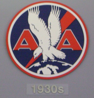
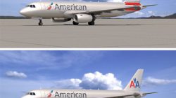
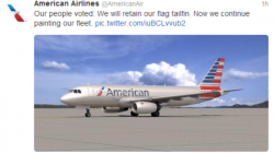
The rumor mill is back in full force to answer one of my questions regarding American Airlines purchase of Airbus A320s, specifically how will they paint the aircraft. Since Airbus aircraft come with a bonded primer and do not use Alclad, you cannot get the polished metal look that has been a staple at American for decades starting with their DC-3s.
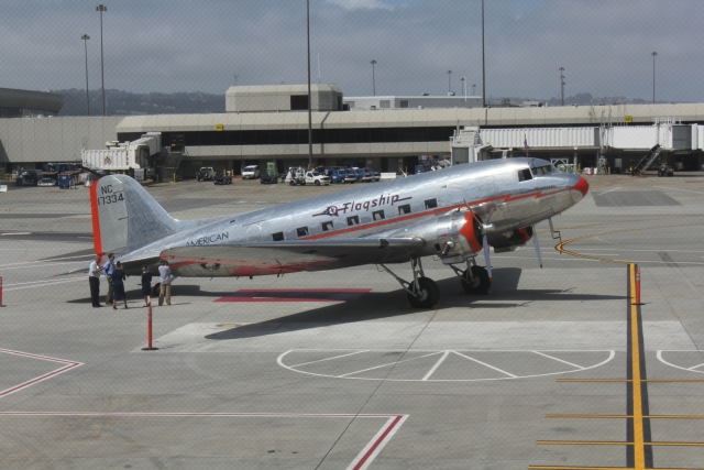
American has always stuck by their no-paint scheme including explanations in their American Way magazine
The unpainted plane became an American hallmark in the 1930s when the Douglas DC-3, which was developed specifically for American, became the workhorse of the commercial airline fleet.
While other carriers chose various color schemes for their aircraft exteriors, American’s managers admired the metalworking craftsmanship and the crisp, no-nonsense, high-quality look of the DC-3’s gleaming aluminum skin. Since they thought the airplanes looked great as they were, they saw no reason to add paint.
In the years since, the aesthetics of the exterior have gotten even better. Today, the fuselages of most commercial jet aircraft are made of “Alclad,” which is a thin sheet of pure aluminum bonded over the various metals used in an airplane’s structure.
In addition to the aesthetic, there are several very tangible benefits to our gleaming livery. No paint means less weight, and less weight translates into reduced fuel burn and lower operating costs.
Meanwhile United has changed liveries four times in the past two decades and Delta about thirty. (Delta has a number of misteps in that area in my opinion, but I’ll leave that for another post).
When American received their first Airbus A300s they were painted grey and the AA livery was applied over the grey. It was close, but always looked odd.
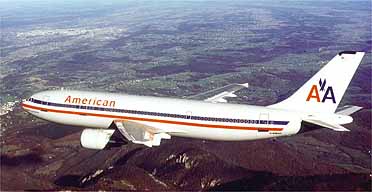
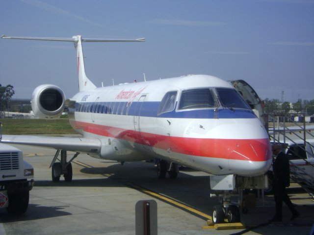
And there are sevearal American Eagle aircraft that are painted white.
With the 787’s on order, made of a large percentage of composites, a new scheme may finally be necessary. What do you think the new livery should be? A departure from bare metal look to something white? Do you see the famous cheat line going away? Should the long in the tooth Helvetica font go away for something more modern? Personally I’m pushing for a revival of one of the older more agrressive looking logos.
