A few weeks ago I took the opportunity to compare Hipmunk, an up-and-comer in the world of travel search, to the 800-pound gorilla we know as Kayak. Although I liked a lot of what I saw in Hipmunk, it fell short in a few critical areas. The events that followed really knocked my socks off. Maybe it’s because I’m a newbie blogger, but I was not expecting the folks at Hipmunk to email and call me to talk about the shortcomings I saw in their product. I was happy to chat with them because, as I said, the product overall is very promising even if it still needs a few changes. If you want to check out new softwares, you can check this appointment software.
I had a phone conversation with Hipmunk CEO Adam Goldstein and will continue to stay in touch with them as new product developments are rolled out. Adam seemed genuinely interested in some of my concerns, explained why certain decisions were made, and pointed out a few features I may have overlooked. I’ll start out with Hipmunk’s flight search tool and discuss hotel search tomorrow.
In my original review I rated Hipmunk and Kayak roughly equal but gave the edge to Kayak because some information was made more obvious and there were a few additional booking links to provide some true comparison. Each side had a few unique tools, and in that respect I gave Hipmunk the edge for being more creative or at least bringing over features I love using on other sites.
Big Things
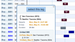
My biggest criticisms of Hipmunk were that (1) some airline names weren’t displayed on short flights and (2) the airline name wasn’t very obvious in the pop-up box when you clicked on a flight. These are pretty minor but at the same time seem like easy things to fix.
Adam explained that Hipmunk originally tried to use two-letter abbreviations (like UA instead of United) but this often confused inexperienced users. I guess not everyone knows that JK used to mean Spanair. 😉 I can certainly understand that view, but I still think that showing nothing isn’t any better even though it’s a small number of affected flights. I don’t want to have to click on the flight to see which airline is operating it. The current text used for these labels could be made smaller to fit shorter flights, but I have young eyes. Another option is to display the airline name when you hover, without requiring a physical click.
As for making the airline name more noticeable in the pop-up box, that’s really a design issue. I filed my complaint and asked for some color to make it stand out, but I will try not to be a backseat driver.
Little Things

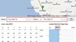
I also suggested that Kayak’s calendar search was more useful and that I didn’t particularly care to have Hipmunk’s search results filtered. Hipmunk tries to maintain a very clean look and removes duplicate flights that have very similar options, instead showing you the best one. This is most often an issue when you have to connect, and you can still see all the variations if you like by clicking on a tab. I think it would be nice if Hipmunk switched to a calendar feature like the one Google Flight Search has developed, which is really useful.
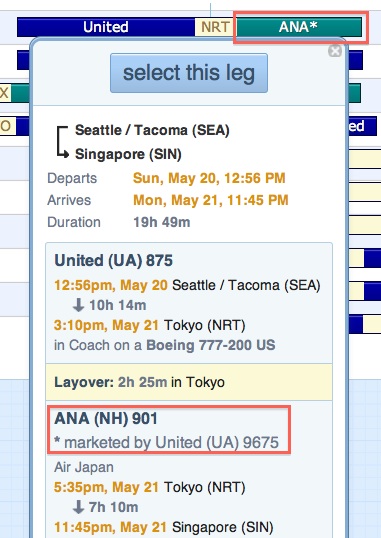
What was strange to me is that even though Hipmunk gets some of its data from ITA and uses a similar time bars feature, it implements it with one slight but noticeable change. With ITA, a codeshare flight will display with the colors of the marketing carrier and an asterisk next to it. So if it’s a UA code number operated by ANA, it will look at first like a UA flight. I have learned how to interpret the asterisk and usually can predict the operating airline based on the route.

What Hipmunk does instead is display the operating carrier and use an asterisk. It will then say it is marketed by someone else. This actually makes more sense, but I think anyone with significant ITA experience needs to be careful and pay attention or they could be mislead. Some loyalty programs base mileage accrual on the operating airline, and others base it on the airline that sold you the ticket. In some cases the number of miles earned can go from 100% to zero.
Things I Didn’t Mention
Hipmunk has created its own metric called “Agony” to rank flights. You don’t have to use it, but they market it as a quick way to let them do the work to find you flights that are the best overall, not just the cheapest. This is not always easy to do with a site like ITA when the best option may sometimes cost $5 but is found on page 3. It’s near impossible with Kayak, which is one reason I switched to ITA. Although I don’t think Agony is terribly useful for someone like me who enjoys sorting through all the options, I can see its value.
Adam was keen to let me know that Hipmunk has incorporated some of the advanced routing language that you’ll find in ITA. These are the commands like “::UA UA,AC+” to specify one flight on United followed by one or more flights on United or Air Canada. They are part of what makes ITA so useful to advanced hackers but a little intimidating to beginners. (I have a very thorough walkthrough of ITA’s routing language here.) You wouldn’t even know Hipmunk offered it unless you tried it yourself, and some example commands will appear after you type the double colon. For an example, try typing “SEA::” in the “from” field and see what you get.
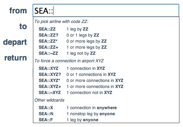
You can use almost any of the ITA commands that follow a double colon, which I described in detail in an earlier post. However, there are limits. You can’t use advanced routing language on a calendar search when the exact dates are flexible but you know you want to travel sometime in July, for example. You also can’t use any of the commands that are preceded by a forward slash “/”. These include things like specifying booking classes (“/f bc=w”), specifying alliances (“/alliance star-alliance”), specifying connection times (“/minconnect 60”), or eliminating redeyes (“/ -redeye”). I really like making use of the first two, and I also like using advanced routing language in calendar searches on ITA. But I also know that most people don’t. The fact that you can some of them is good enough for most people. Hipmunk could still stand to explain them with a little more detail because I think only the experts know about it, and those experts might prefer to use ITA. As it is now, it only describes the function of the command after you type it.

Thinks I Didn’t Know
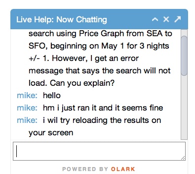
I noticed but didn’t originally use Hipmunk’s help feature. There is a small blue bar on the lower right corner that says “Click here for live help!” and it does exactly that. Click on it and a pop-up box will appear that connects you to a real person who will answer your questions and walk you through any problems you’re having. I took advantage of it when I was working at Panera and faced some issues we tracked back to a slow Internet connection. Although it wasn’t Hipmunk’s fault, I learned some interesting things.
First, the help desk is staffed by a real person and probably by someone at their offices. This means that if they’re out at the moment you can leave a message so they can get back to you (good). Once you get help, it’s someone very knowledgable about their product (even better). We had a short discussion about the limits of the routing language in which I learned about being unable to use it for a calendar search. Finally, if you still can’t get it to work on your own, the help desk is able to do the search for you and “push” the results to your computer. Now that’s what I call great customer service!
Conclusion
While I am still not sure that Hipmunk is a go-to tool for the very best travel hackers, I don’t think those people are coming to me for advice, either. They know what they want and are probably happy to piece together itineraries using the raw published fare data and seat availability on ExpertFlyer.
For everyone else, I recommend Hipmunk. It’s easier and friendlier to use than the websites of most airlines or online travel agencies, and it’s a lot less cluttered than Kayak with a few extra features thrown in for good measure. I still think you should book your tickets on the airline’s own website to ensure good customer service in case things go wrong during travel, but that’s a separate issue. Hipmunk will present you with your options and help you pick through them before presenting the booking options which will include the airline website among them. My only caution is that you should pick the one for United or Alaska instead of Orbitz.


